


Overview
July 2023 - September 2023, updates from 2024/5
I decided to make the design for this app out of interest to serve my Coptic community and the needs that some of them might have when it comes to their spirituality and how it interacts with their social life.
-
I surveyed members of my religious community to see what they use in their routines and what their needs might be.
-
Through the survey data and my research, I took the apps whose features would be most compatible with what the solution to our user’s problem/need might look like.
-
I start to sketch and organize features that might appear in the app and categorize them according to their purpose whether it be to keep a routine or interact with others, then into a navigation bar.
-
I continue looking into other apps that have singular features I want to use in the design. They can be summarized as Google Docs, Locket and Freeform.
-
I created a mood board, keywords and color swatches to determine how the app might look and feel according to its purpose/ problems it is solving.
-
Here, I update the proposed color scheme for the app in accordance with accessibility standards.
See Updates and Considerations to learn about changes to be made in colour for better accessibility*


Christians want to find a way to connect and check-in on their friends and their spiritual habits through a casual and fun, yet intimate way. They also want a way to keep up with their spiritual habits with the option of doing it socially.
Problem
I designed an app that allows Christians to send messages to their friends or contacts by displaying their status or activity on the Home screen through widgets. The user can check in on their friends to ask if they prayed, read their Bible or reflected on their day by sending specific Home screen alerts. These alerts will be exclusive to the user’s contacts where they can create shared widgets on the Home screen to draw, message, share devotions, verses and more! Moreover, Catch Up With Christ (CUWC) will contain a variety of social and personal features to keep the user on the spiritual track they desire.
Solution
User Research
I surveyed 30+ Coptic Orthodox Christians asking them questions about their spiritual habits and here are the results.

In conducting user research, I found that these are the most commonly used apps among young Coptic Christians ranging from 18-35 years old. Personally, I know that the majority of these apps are also used across our Coptic diocese as well.


Some more results from questions targeting the habits of Christians in their spiritual life can be displayed below.
The majority of users have admitted that they either sometimes or completely forget to pray and read their Bible. The majority would also prefer if they were reminded to do so.

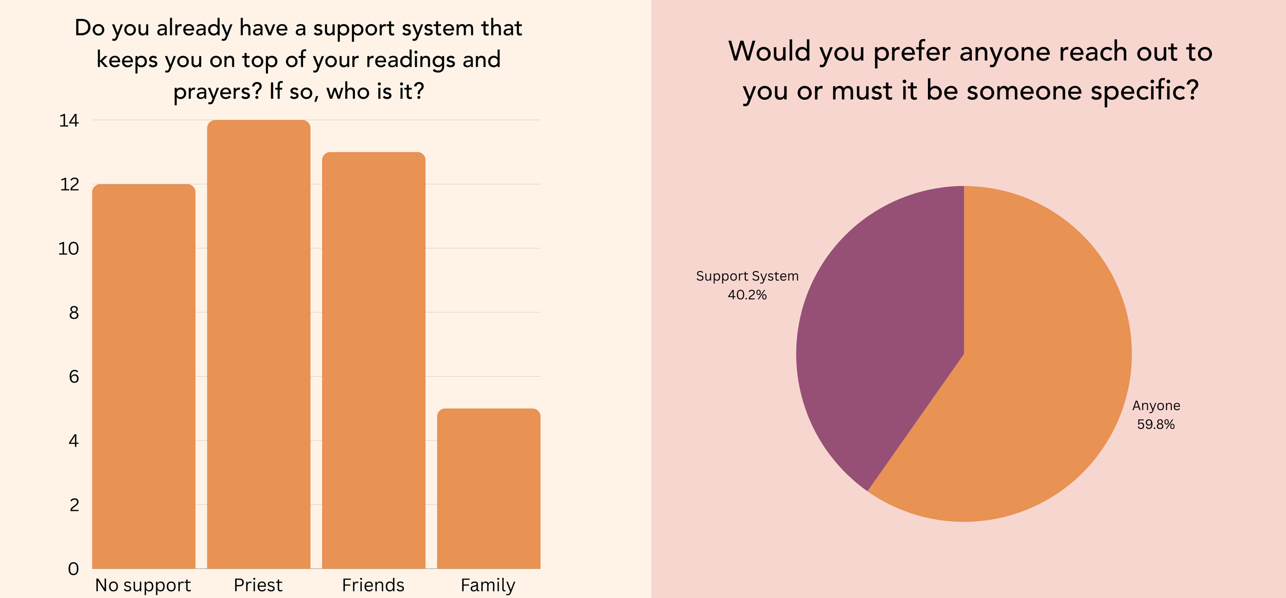
The majority of participants are either supported in their spiritual life by their assigned priest or friends, while a large portion of people do not have anyone to support them at all.
Participants also noted that they are mostly impartial to who reminds them to pray or read. This is good because the app can have both capabilities, but is also welcome to be made more social by the user.
Here are the common ways that users use to remind themselves or keep their spiritual life afloat:
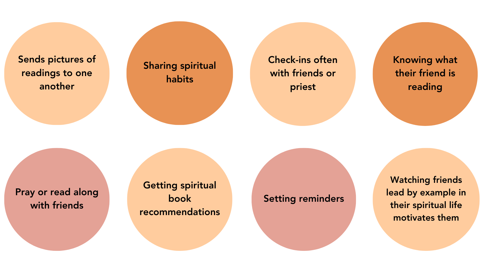
Most users use widgets on their phones. Users would also prefer a pre-made plan over making one on their own however the remaining users like to go their own way.

We can gather a number of things from the data of these participants, but most importantly there is a need to for assistance in staying on track with spiritual life and a preference towards having that assistance be social and full of fellowship.
Most Christians surveyed sometimes or completely forget to read their Bible and pray daily
Most would like it if they were reminded to keep up with their spiritual habits
A large portion of those surveyed did not have a support system in maintaining their spiritual habits and a large portion also had their friends and clergy as support
Most people did not have a preference for who reached out to them to keep up with their spiritual habits
Most of those surveyed use widgets on their phone
A majority of those surveyed also greatly favoured that that a Bible reading or prayer plan be made for them
Finally, a majority of those surveyed prefer that the app be unpaid
User Needs Summary

Persona based on user survey. Photo by Oladimeji Ajegbile
Competitive Analysis
Aside from the apps that the research has shown users use, there are four apps in the realm of capabilities of what CUWC could have to address user’s needs.

Two of the apps are ones that the survey indicated users use, which are Hallow and YouVersion.
The other two apps, Metanify and Locket, also have elements of use for the final app. Locket is the only purely social and non-religious app and the only app that uses widgets as its main feature.
Metanify allows the user to connect to their assigned priest and schedule appointments along with other resources. But, what is notable in the social aspect is that it is able to connect clergy to the user.
Locket simply allows users to share pictures with their contacts through home screen widgets and allows people to comment/react to them.

The chart displays the similarities and differences between the four apps. For the most part, all of them contain a social element, with Locket being the most social as the user is able to communicate with friends directly. With the other apps, the social elements is linked to a broader online community.
All the apps minus Locket contain spiritual resources for growth. Something to takeaway from looking at these apps is the way I want to incorporate elements of them in CUWC. I think what will make the app unique is the combining of the best parts of these apps, from Locket’s personal contact only sharing to Metanify’s daily spiritual canon.
Idea Generation
Here, I begin sketching out the capabilities and features of the app. I’ve researched commonly used apps, surveyed the community for their needs and try to encompass both in the initial sketch of ideas.
In the first image below, I begin brainstorming the logo of the app and what I want the brand to convey, which I will go into detail with below.
I focus quite a bit on the way to add user contacts, and how that transitions into messaging other users. It would most likely be that the users both have the app and an invitation is sent to be added as a friends by phone number. The user can then choose which contacts have permission to see the full parts of a user’s profile.
Then, I began sketching a bit of how the social bulletin would work and how to restrict contacts from viewing it if the user wishes, how to add friends and what something posted on it might look like.
Next, I looked into the Bible and reading system, starting a reading plan and adding friends to your reading plan and annotating together.
Last, can be seen a rough drawing of the user’s settings and permission controls.

I tried to take some of the ideas from the sketches and create a chart with it, encompassing most of the capabilities of the app besides the messaging system. The messaging system is not included at the moment as it is present in most social apps and for now is a smaller part to plan in comparison to the other shared features of the app.
Split into three categories, the chart displays the broad features of the app in mind without going too into detail on the full capabilities of it. The main features of interaction between other users is the shared Bible, widget messaging and shared bulletin. From the user survey the chart also displays that the app has Bible plans, reminders and trackers. Finally, the chart displays the user controls and how the user can choose who views what they create on their bulletins and who can be sent widgets.


This chart is the basis for the mock-up shown atop as it goes into enough detail to more accurately display the interface of the app and map out user interactions and the features present in each tab of the navigation bar.
The card containing a purple label are things the user experiences passively. Whether that be seeing their notification, seeing their reminders, seeing Bible plans or board’s they have started.
The cards with an orange label are features which the user actively does. This can be adding contacts, creating and sharing boards, setting reminders and setting up their Bible. Those labelled with pink are the beginning of some more complex inter-tab connections where one press leads the user to another tab, rather than staying in the same one.
Last are the unlabeled cards which are the user permissions which will most if not all be an on or off toggle in their settings, profile or contact’s profile.

In the rough flow above each tab of the navigation bar expresses its function.
Moving from the loading screen in to the Home screen, the app opens on the user’s daily tasks, habits and display of competition progress if that applies to them. The user can add any of these to their calendar and the frequency by which they will be displayed to complete.
The Bible tab opens on a display of which Bibles you already have open and the types of plans you can add to your Bible. Then it displays a bit of how the collaboration of annotations will work and how changes display on widgets.
Next, is the Community tab where the user can access their competitions between contacts and bulletins. Users can begin with a personal bulletin and share theirs for others to join.
Then we have the chat or messages tab which is just adding and speaking with contacts. Users can also view other user’s profiles and change what they are allowed to see.
Finally, the user’s profile contains their profile picture in the app, their status and the ability to change their permissions.
Feature Research
In reaching the latter design of the app, there had to be a refining of its features from the initial ideas.
Hammering out exactly how the user will move through and from tabs on the navigation bar is critical in deciding if certain things are necessary or are bloating the entire experience.
A way in which to determine good design is to look at already effective design in action.
In outfitting the components of each tab, I modelled some off of part of another digital services.
Shared Bible
The first of the major features is a shared Bible between contacts.
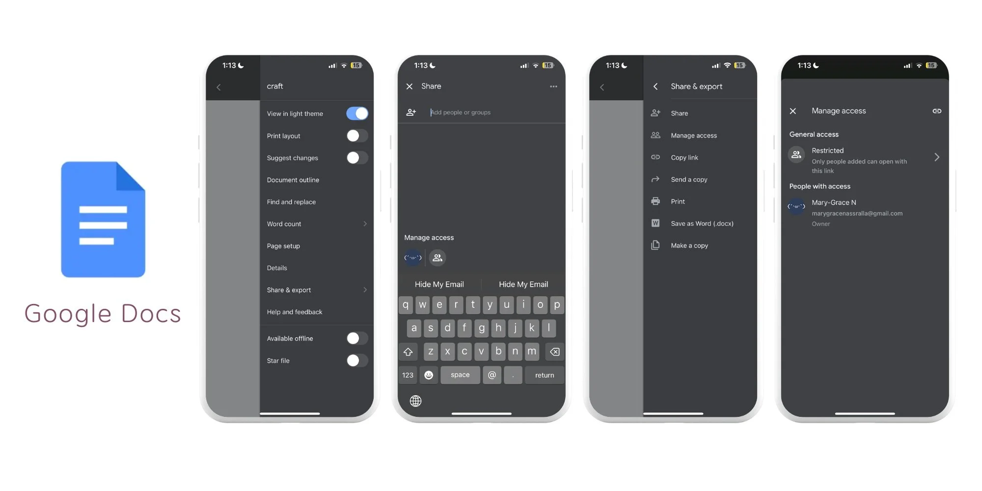
The shared Bible element of the app is modelled similarly after Google Docs. Google Docs allows a user to begin making a document and later add someone to it.
In the same way, CUWC allows a user to begin reading and add users as they go. Users can then see their shared annotations and notes.
Additionally, right from adding people to a document, Google allows permissions for editing and viewing to be altered at any time.
If a friend wants to join you for reading just for a book and not for the whole Bible the user may add and remove them and the Bible goes back to being their personal Bible, but still contains a collaborator’s annotations.
The user can see their shared, personal and plan followed Bible when they open the Bible tab.
Before started to read, if a new Bible is to be added, the app will ask which version the user would like to use, if they want to use a plan, if they want to use a commentary and what they want to learn (by categories).
If a user indicates they want to learn the ‘fundamentals’ for instance the app will provide them with a plan to provide them with knowledge of core Christian beliefs (modelled mostly off of Oriental Orthodox teachings).

Bulletin Board
The shared bulletin between contacts is categorized as a community feature and would be modelled after Freeform:
In Freeform, the app opens displaying a blank screen with the options of beginning a new board.
From there the user can add people to the board and view the different category of boards they have from private to shared.
In Freeform, the board gives the user the ability to add photos, text and drawing.
What will differ in the board in CUWC is that access will be able to be granted to view, comment and edit, not simply to just edit the board once invited.
Access can be revoked at any time
Anytime any of the collaborators use the board others who it has been shared with will receive a notification of the activity on it in the form of a widget on the Home screen regular notification and an in-app notification if the user so chooses.
The user just needs an invitation to the board to view it to receive notifications that there is activity on it.

Widgets
The widget features would be modelled off of Locket and the general IOS features that Apple and Android provide for widgets.
Locket allows users to share photos that then appear on a contacts Home screen widget of choice.
For many of the Community and social features of the app like:
Notifications of someone using their bulletin
Reminders, messages from in-app added contacts, etc.
Those will be displayed on their home screen widgets so that:
Users are more personally connected to the select contacts that they have added.
Are able to be checked up on by them personally and regularly.
Once a user receives a widget of a message, reminder or activity on a board they can press the widget and enter the app.
Messaging System, Profile and Permissions
The messaging system will work similarly to most apps where once a user successfully adds the contact of their friend through the invitation system in the community tab.
Users can:
Access the ability to message contact through the app through profiles.
Start a conversation with a contact by pressing the start writing button in the top right corner of the messaging tab.
The messages that the user is sent can be made to be sent as standard notifications or can be made to be sent through the home screen’s widgets if the user uses them.
The user will be encouraged to create and or allow the app to use widgets for the best experience.
User’s contact profile can be edited to add a picture and status.
The profile contains all the permissions that the user sets for themselves, info on what the app can do, and what others are able to see or do on user profiles and interactions.
Permissions include the app’s ability to:
Access contacts
Allowing the app to use widgets
Making certain bulletins public or private, etc.
Users can create competitions with one or more contacts.
Competitions can be for things like finishing a book of the Bible the quickest or maintaining a good habit for 30 days as examples.
Competitions are created in the community tab and are displayed on the Home tab.
The user can press the status of the competition on the Home tab and it will lead them to the Community tab.
Competitions
On the Home screen tab, users can set habits that correspond with the Home screen calendar
They can set the frequency and purpose of the reminders
Users can list habits they wish to curb or practice and put it on the calendar to track and check off.
Alarms and reminders can be set according to the calendar to remind the user to complete their habits, prayer or readings.
Tasks, Reminders and Trackers
Brand Identity

I also began developing an idea for a logo. Initially, I had wanted the logo to be personal and social. So I thought of an image of people interacting in some way.
I looked into the possible colors I could use and found that warmer and brighter colors signaled a more friendly brand.
In the beginning, I thought of making the app someone hugging Jesus Christ or two people hugging one another similar to the minimalist hug emoji.
But then, I settled upon making it three people holding hands and raising them together toward the cross.
This change emphasizes the purpose of the app in a greater way, showing that Christians lift one another up toward Christ. The number three also has significance in broader Christianity and more specifically from the Coptic Orthodox Church which I am a part of it may remind users of Shadrach, Meshach and Abednego.
We call them the “three saintly youth”. The story originates from the book of Daniel where the three were in thrown into the furnace for their faith and an Angel protected them and they were not harmed. It is a symbol of the resurrection as the cross is signaling in the logo, as the three youth were victorious over evil through the power of God. In simpler terms, these were three friends who stuck together and were strong in their belief and practices of God. The app is primarily made for friends to lift each other up in their spiritual lives, encouraging them to remain consistent.
Update on Colour
2025: As I learn more about the importance of accessibility regulations like WCAG and AODA it is important to update things like colours for readability. I ran my colours through a contrast grid to see which ones pass the WCAG standards.
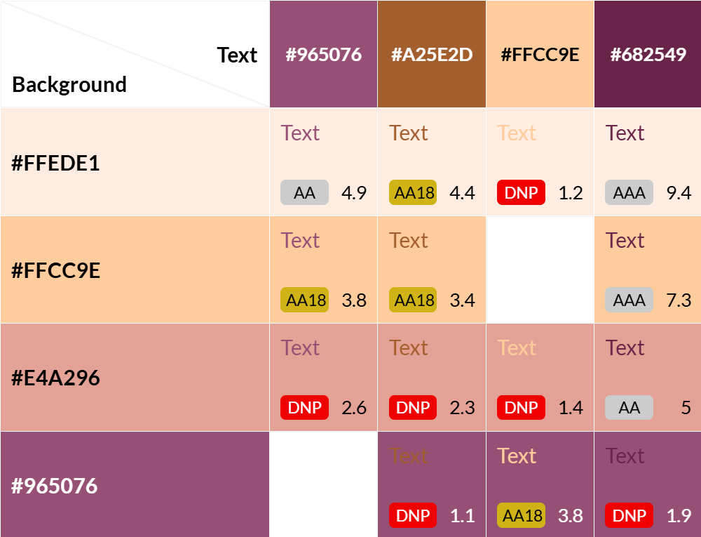
Easily, I was able to see that the majority of the colours I used did not pass and were difficult to read. This went unnoticed by me because some of the text that might not pass or are less readable were ones I had as larger text. Moreover, because I was able to see the distinctions I did not consider other who might not be able to or have trouble doing so.
Continuing to learn about these standards and accessibility generally has taught me to consider the needs and wants of others at every step of the research and design process.

Here is what a more adjusted colour palette may look like.
Next Steps and Takeaways
I greatly enjoyed going through the creative process of this app. It is definitely something that I can see my friends and I using to encourage one another and share our insights on. There’s a lot of room to be social on the app but not to a fault where it takes away from the purpose which is to pray and read the Bible.
Moving forward:
I might consider pursuing this as a project to be made in collaboration with possible developers from our church. The shared Bible feature I think would be a hit especially!
It is interesting how much this idea developed from being primarily a spiritual reminder app with the widget feature being at the forefront to an app with many capabilities and focuses.
I also definitely need to flesh our and create more mock-ups of the other features of the app and take into consideration the accessibility of the display.