
Budget Bites 🍴
Budget Bites 🍴
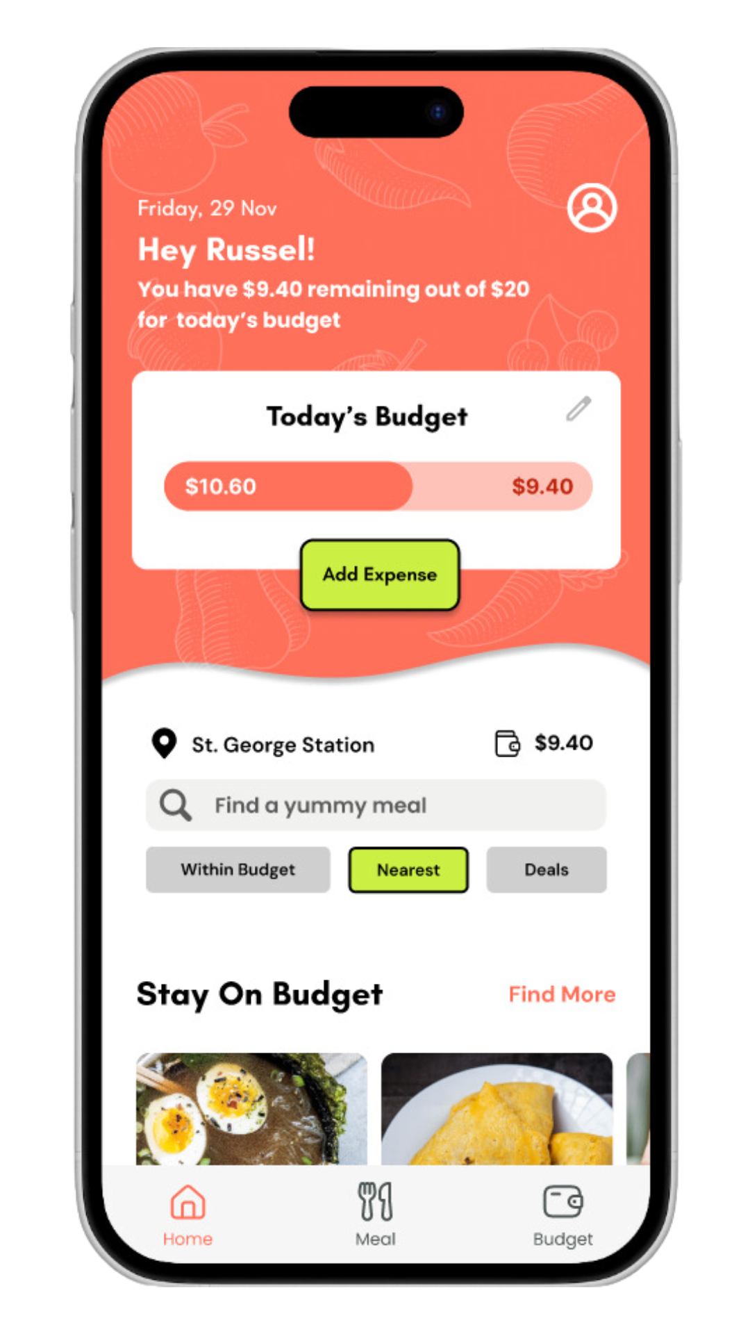
Check out your daily budget

Find meals within your budget

Explore different options near you


Have the nutritional facts of any meal
Log your meal and see your savings!
This project was completed in a group of 4 for a Masters level User Experience Fundamentals course. My 3 team members were Alle Ann Sobrejuanite, Neha Choughule, Hong Phuoc Ho.
All student projects of this course had to do with problems students faced and our prompt was “Healthy Food”, but we were free to consider other demographics at the beginning.
Overview & Skills
Duration: Sept. 2024-Nov. 2024
-
We as a team each interviewed 2 students about their eating habits and food lifestyle.
-
Our team compiled the interview data into notes and codes to turn our qualitative data into something more quantitative.
-
Here we took the main features and problems we wanted to solve and ordered them in order of priority in what we want for our users based on the research.
-
We started to develop our visual identity, brand and what sets us apart.
We also decided on how we want the app to look and feel using a combination of different UI designs.
-
In the future, I may continue testing the ‘final’ prototype and gather more data on its effectiveness. I might also experiment with other ideas for features.
-
User research and testing
Mock-ups, wireframing, prototyping
Collaboration
Communication
Pitching
I managed our weekly meetings, deadlines and deliverables to keep us on track
I helped to identify our stakeholders, create personas, our initial journey map and vision for our solution
I sketched and created a user flow for our user path of finding and logging a meal and a functional wireframe for our user’s path in the idea process
I co-presented in 2 playbacks and a final product pitch with UX experts
I created a mood board, style tile and mock-up of two screens in our UI and helped facilitate the choosing of which UI features to keep or discard
My Role
Note took from our playbacks and studios to use in our submissions and iterations
I conducted background research to inform our interview script, formatted our research plan and conducted 2 user interviews complete with transcripts and accompanying notes
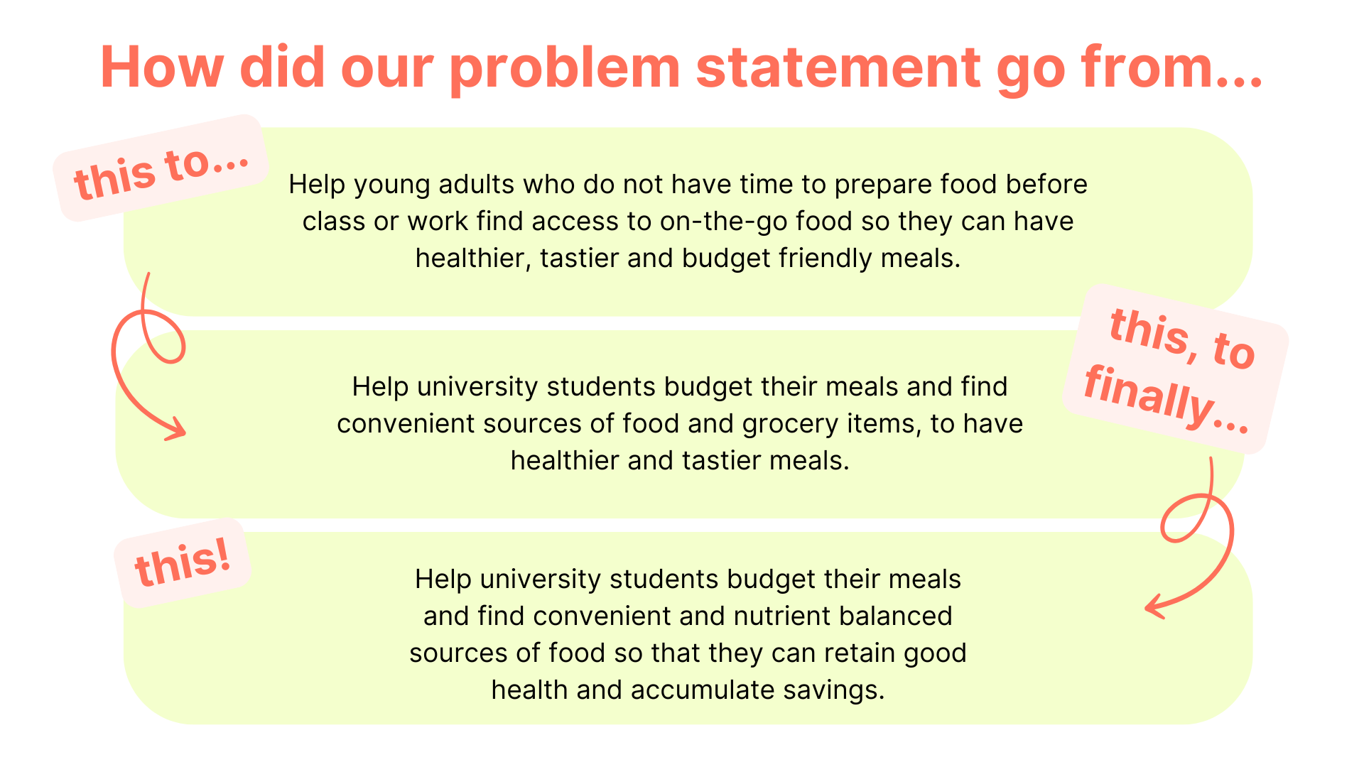
I prompted my team to revise our problem statement to best fit our updated scope
I created our chart for our prioritization of ideas to focus on in our UI mockups and wireframes
Articulated our creative strategy for our final brief
Meals Not Menus 🍛
Specially curated for nutrition and cost - have the freedom to explore what other places have to offer
Hidden Gems 💎
Explore lesser known spots and special deals to save even more
Expense Tracking System 📝
Stay on top of your savings - see trends, set budget goals.
What Makes Our App Different
University students have a difficult time budgeting their meals and finding convenient and nutrient balanced sources of food.
Problem
An app that allows students to locate healthy meals near them, within their inputted budget and diet, that shows them the nutritional breakdown for each meal. Students can then log what they spend on their healthy meals and gather insights on how they spend.
Solution
The short answer is a lot iteration and feedback.
It’s safe to say that when we got our prompt we were excited at the possibilities of improving the lives of students through food. But, before we could venture into the land of solutions we had to discover what exactly what the problem was to begin with. We would not have been able to reach our final problem statement if we rushed the process.
To begin we all conducted preliminary background research into competitors, the needs of students and working adults when it comes to food and the impacts that food has on people who learn and work, constraints in acquiring food and how international students experience food differently when they are away from home.
Through my research, I focused on answering:
What impact does healthy food have on academic success?
Are services like Factor and HelloFresh worth it for the money, health and convenience?
Are students on campus able to easily find healthy foods?
1. Discovery and Background Research
I found that consuming healthy food is correlated to academic success, meal services can be a hit or miss and expensive over time for students and that students struggle to find spots on campus that have tasty, affordable, healthy food.
My team found insights like that fact that many students do not know what ‘healthy eating’ means and might be easily influenced by social media and that time management plays a large role in what students eat.
Our research helped us formulate questions we wanted answered through student interviews:
How and what do students usually eat?
How do students acquire their food?
How do students define cooking and healthy food?
What are student’s spending habits and what do they usually buy or bring to school?
What are some characteristics or inputs we can further elaborate from their “ideal” solutions?
What are student’s likes and dislikes for available solutions (such as food delivery apps or meal prep services) on the market?
We created an interview script and interviewed 8 students in total, each team member performing 2 interviews and analyzing the statements of students.
We also created the first version of our problem:
Help university students budget their meals and find convenient sources of food and grocery items, to have healthier and tastier meals.
2. User Research and Redefining the Scope
From the interviews we discovered insights in the following groups:
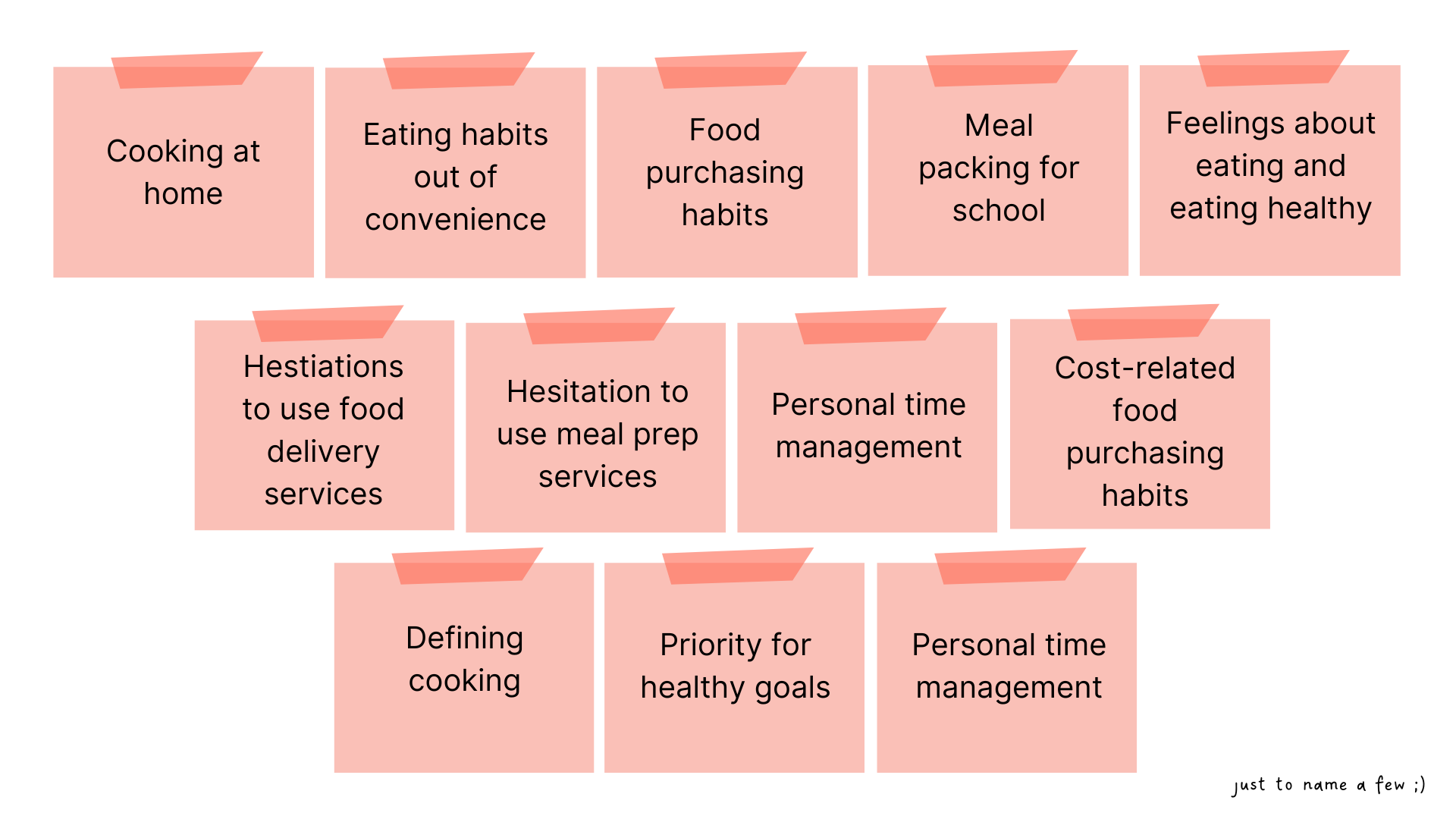
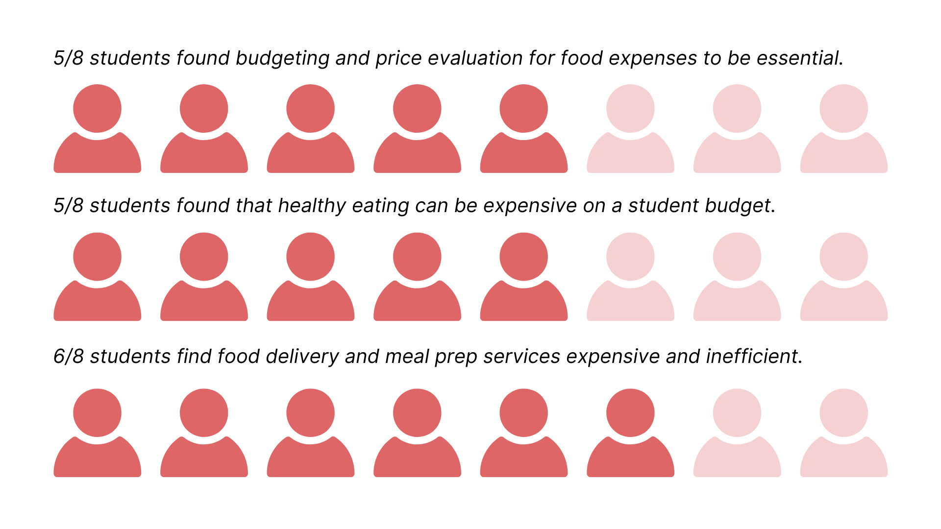
And we were able to use these insights and quantify them into data.
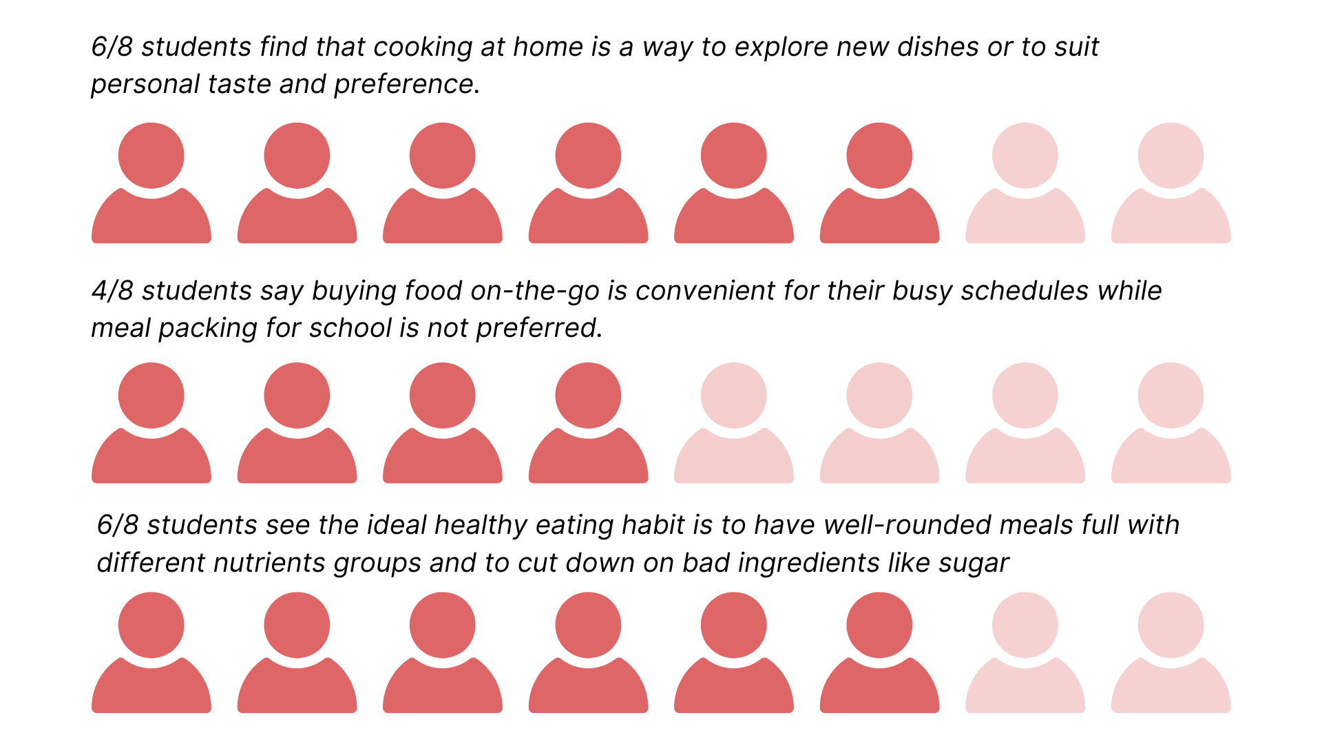
Through the quantitative and qualitative data we were able to define our target user’s top priorities:
Cost and saving money as a student but also wanting to indulge
Convenience because of busy schedules and limited cooking time
Health because students value it and know it helps them with school, but struggle to prioritize it
Our team created this chart to display the major priorities near the end of the project, but it is fitting here too :p
We also received expert feedback mainly to revise our problem statement to reflect our research findings and what we are solving for:
Help university students budget their meals and find convenient sources of grocery items, to have healthier and tastier meals.
With our research and feedback, we moved to focus on budgeting as a main facet of our potential solutions because it is a top priority of students.
Yet, at this point we were still hanging on to grocery items rather than ready made food — which would soon change.
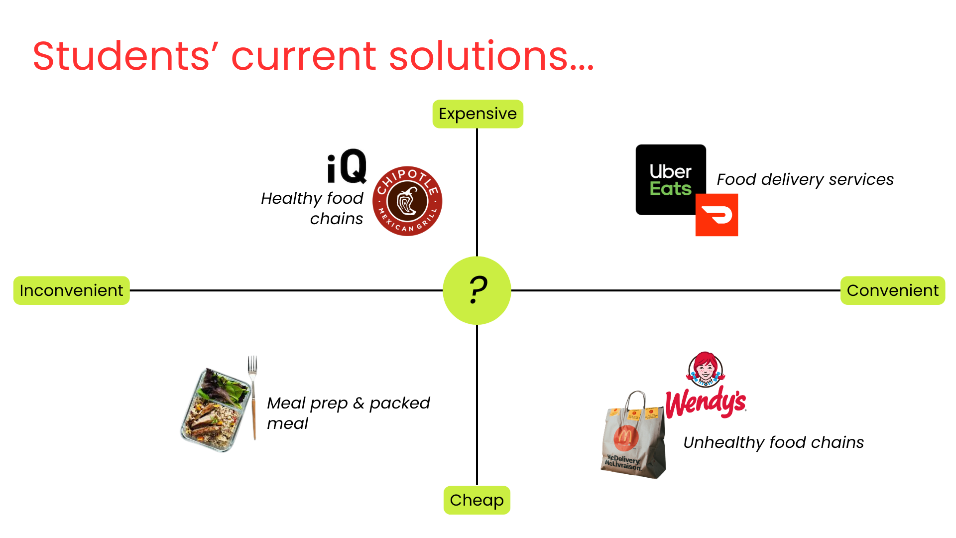
We also realized that those who needed to be involved in our solution were not only the students but we also needed to partner with food vendours and restaurants, since we saw that both university institution meal plans and ready meal services were not cutting it.
3. Design and Prioritization
As a team we generated ideas to help potential users based off of the needs we saw in our research. We dotted some ideas as being priorities, focusing on budgeting, healthy and convenient deals and nutritional information. A lot of our ideas tended to be features for one of our 3 top priorities so we ordered them in tiers of importance in a pyramid.
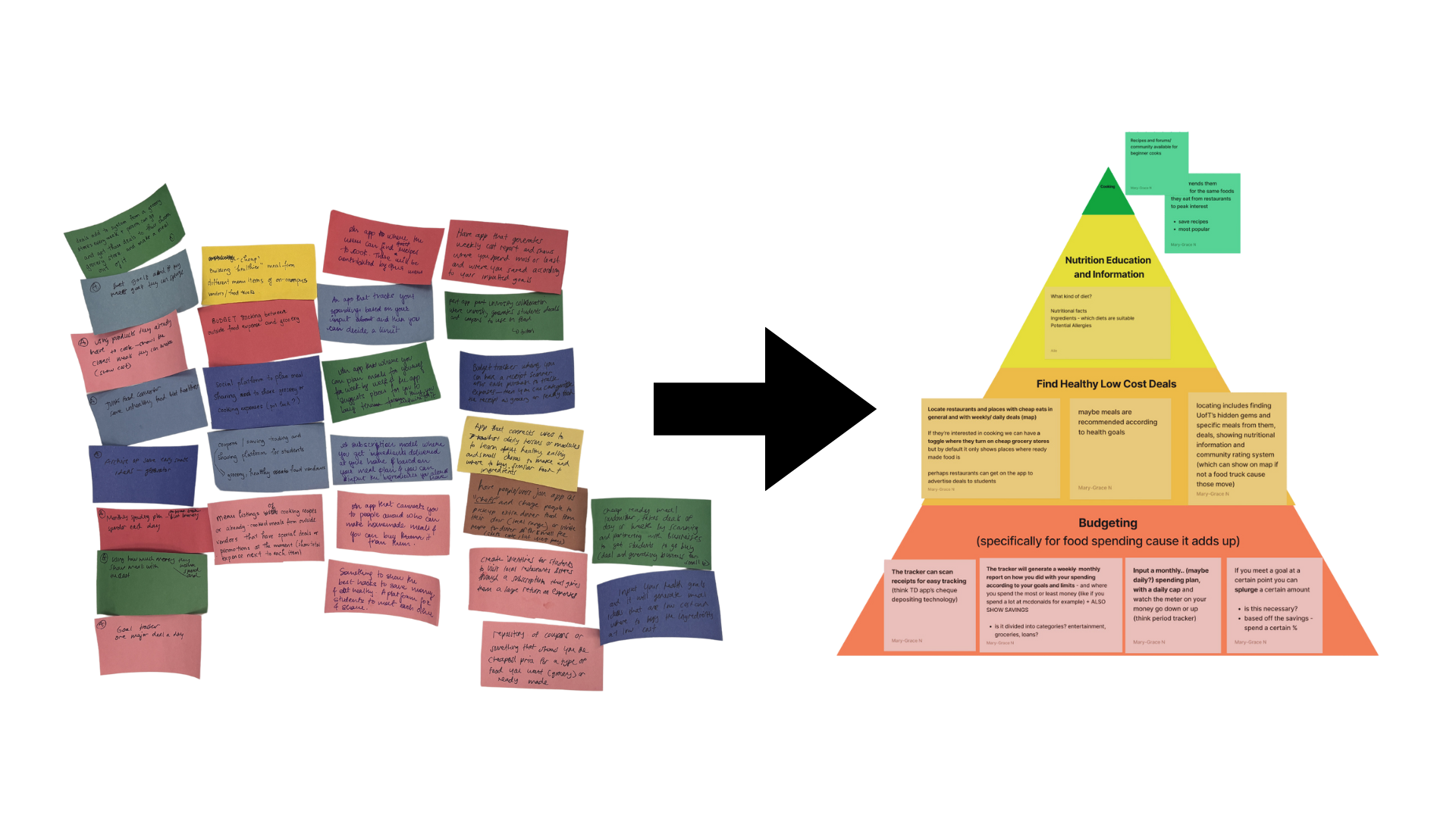
We saw budgeting at the time, as the foundation of the app, then finding meals, nutritional information and… cooking.
Ya we initially wanted to add a section for users to connect to a community and learn how to cook since it seemed many users did not know how. However, we realized a large majority of our research displayed that students do not want to spend time finding a meal let alone cooking even if they were interested.
So, we narrowed our scope to focus on budget, convenience and health. And as you’ll see later the order of priorities also shifts.
Priorities
After writing out our flow we came up with this:

It turns out that this simple sequence could be displayed in a myriad of ways, labels, pages, etc. From our different iterations, testing and feedback the display and functionality of our main path would go through many evolutions.
User Flow Sketches | Logging an Expense
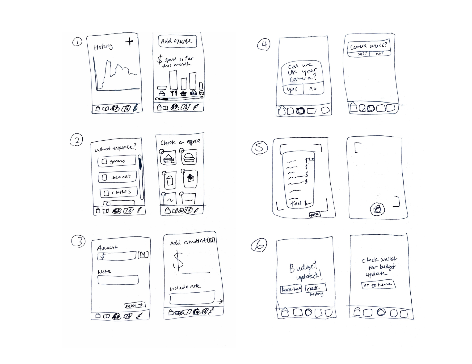
My UI sketches for logging a receipt or entering an amount manually. Here I present two ways the screen could be displayed.
My logging expense into budget flow.
Even after just doing some initial sketches of the flow we knew that the feature of logging a receipt or an expense might not be what is most important. But it was still a feature we wanted to keep.
User Flow Sketches | Finding A Meal
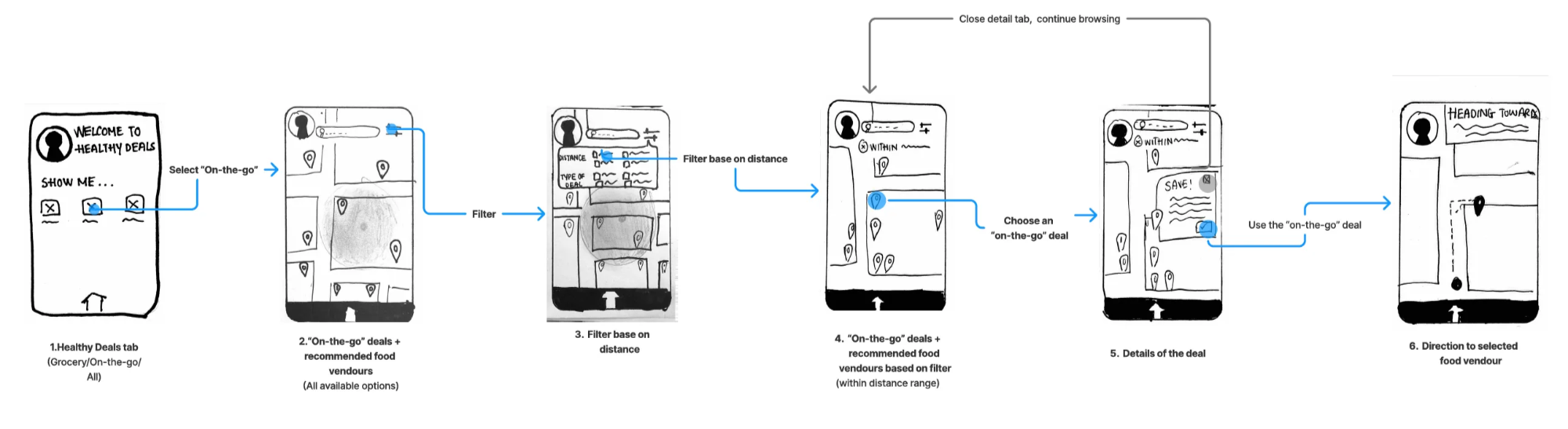
Hong’s user flow sketch for finding a meal
Alle’s user flow sketch for finding a meal.

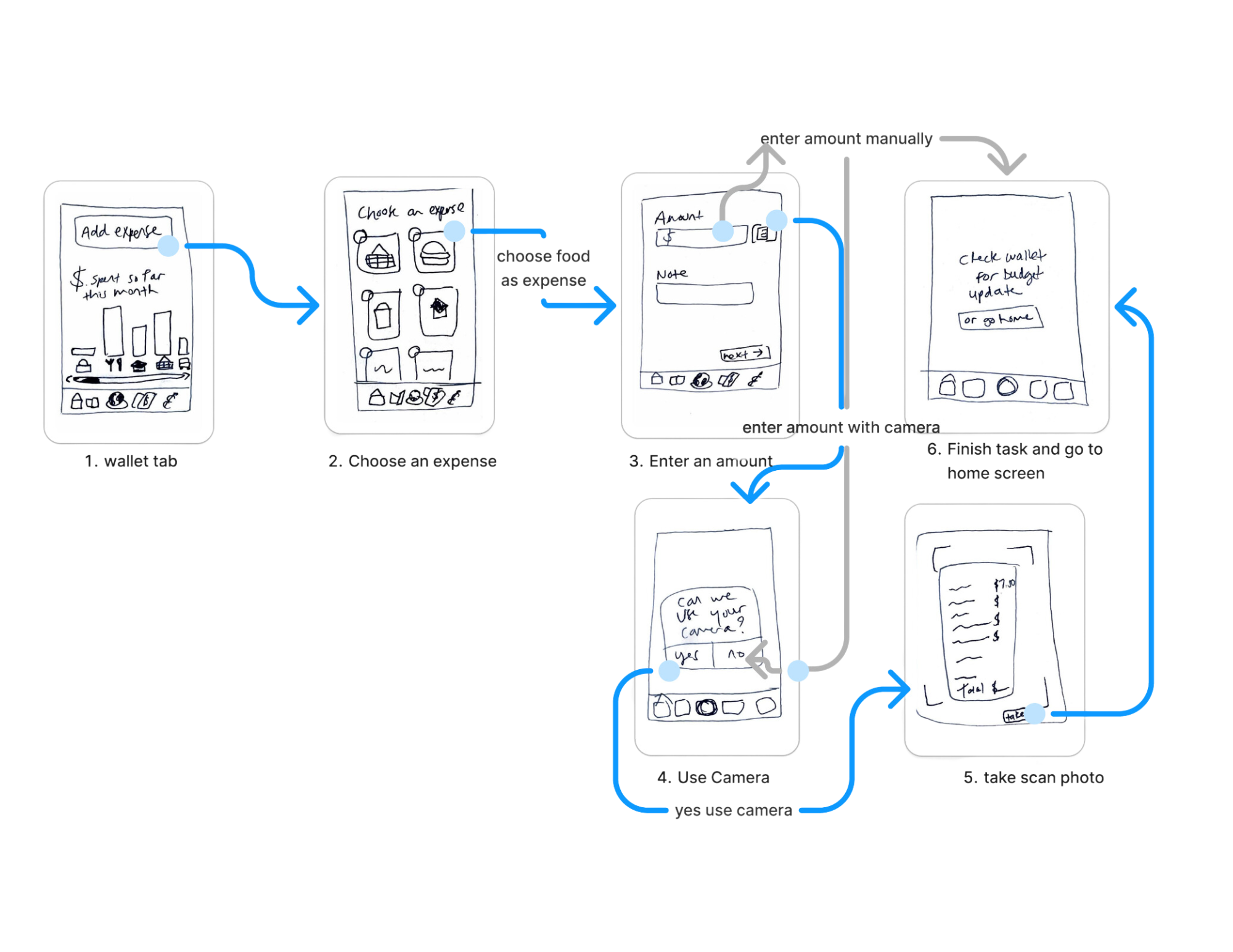
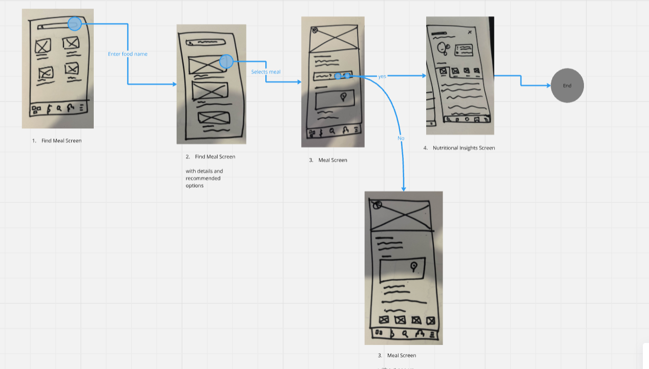
My wireframe screens for finding a meal and logging it into the budget
Wireframes
When we met together and started to sketch out exactly what we wanted the main path of our app to be.
This long image depicts the task of the user finding a meal and would end with the user logging that meal. We took our start and myself and Alle made our own wireframes of the flow.
We initially thought to open the app on a map full of meals so that the finding of the meals would be front and center, but upon trying it out with our studio instructor she noted that the app needs to open on a place the user can make sense of. If it opens on the map the user might not know what they are supposed to do.
From this feedback our group ideated making our own wireframes to see what the best way to display our features were.

My wireframe sequence for finding a meal and logging it into the budget
Here I wanted the user’s dashboard to show their remaining money left for the day. The app then recommends food in their budget and they are moved to the map to find, select and log a meal.

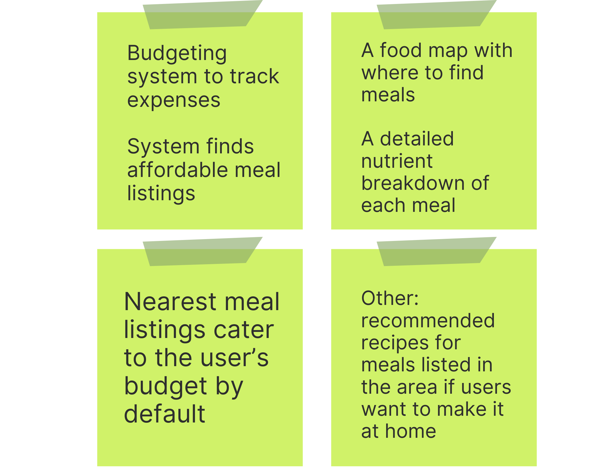
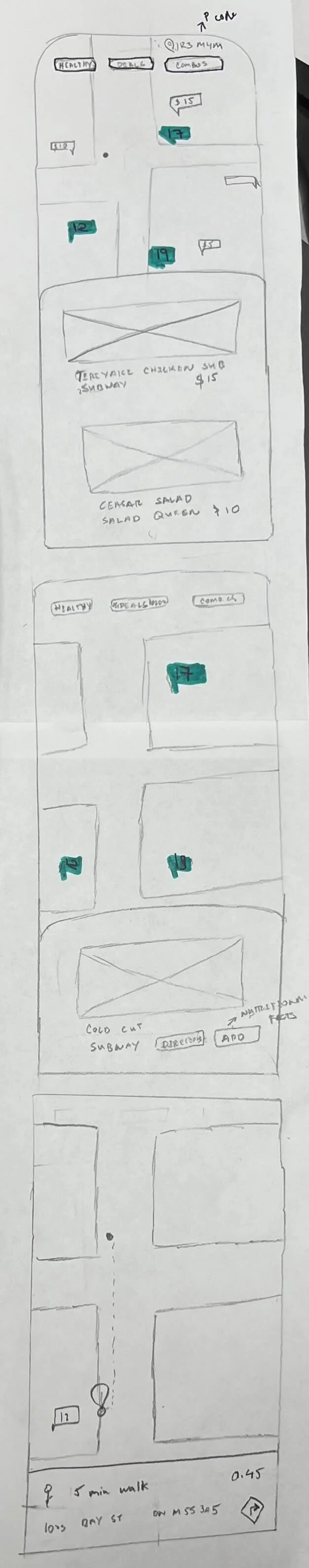
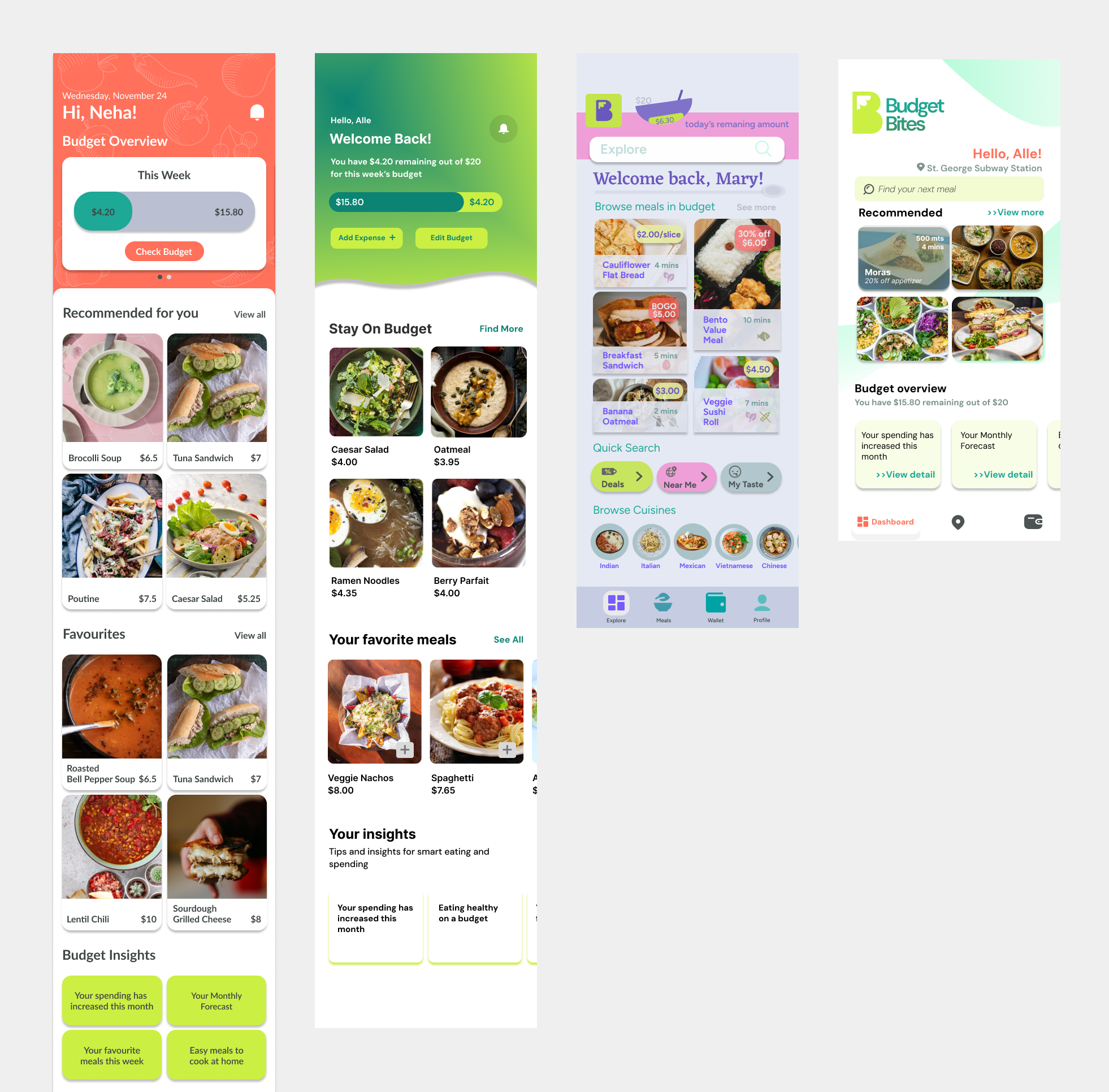
From these we took some features from our wireframes and created a group wireframe with these screens:
Home/Dashboard: display the user’s remaining budget, spending insights and past meals
Meal List Page: A database of meals of various costs, a search bar and some filters
Map: To locate meals selected from the meal page or users can go right to the map to look at what is near by
Nutrition Screen: Each meal contains its nutritional breakdown and more meals from the same vendour that fits the app’s requirements of cost and health
Our team’s initial wireframes

Usability Testing and Expert Feedback
Narrowing Scope
While our initial solution aims to also provide a community space to share recipes and promote healthy habits, feedbacks from experts and usability test suggests that we should narrow our scope to focus on budgeting and healthy food navigation.
By keeping the scope simple and manageable, we can focus on the the main calls to actions which are meal budgeting and finding cheap, healthy meals
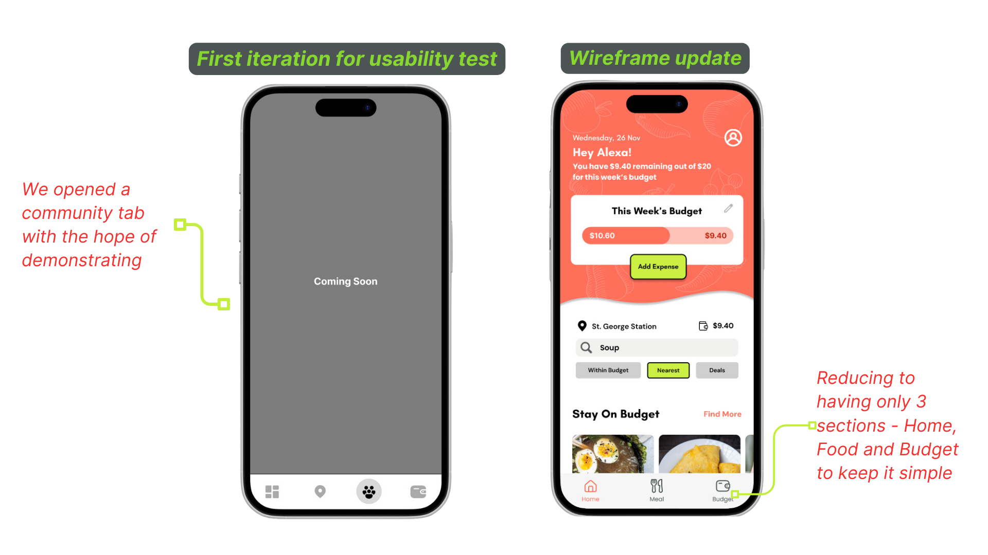
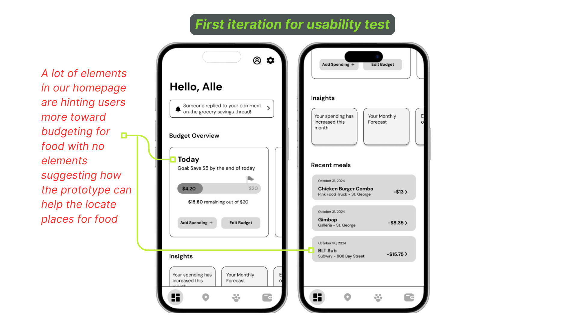
Unclear Purpose
A main problem we had when running our usability test is that our homepage focuses too much on budgeting; thus, overshadowing the app’s other goal to help students navigate to budget-friendly restaurants and diners nearby.
To address this, we add an explore section for food options for users to generate ideas and to clearly present our solution objectives on the homepage.
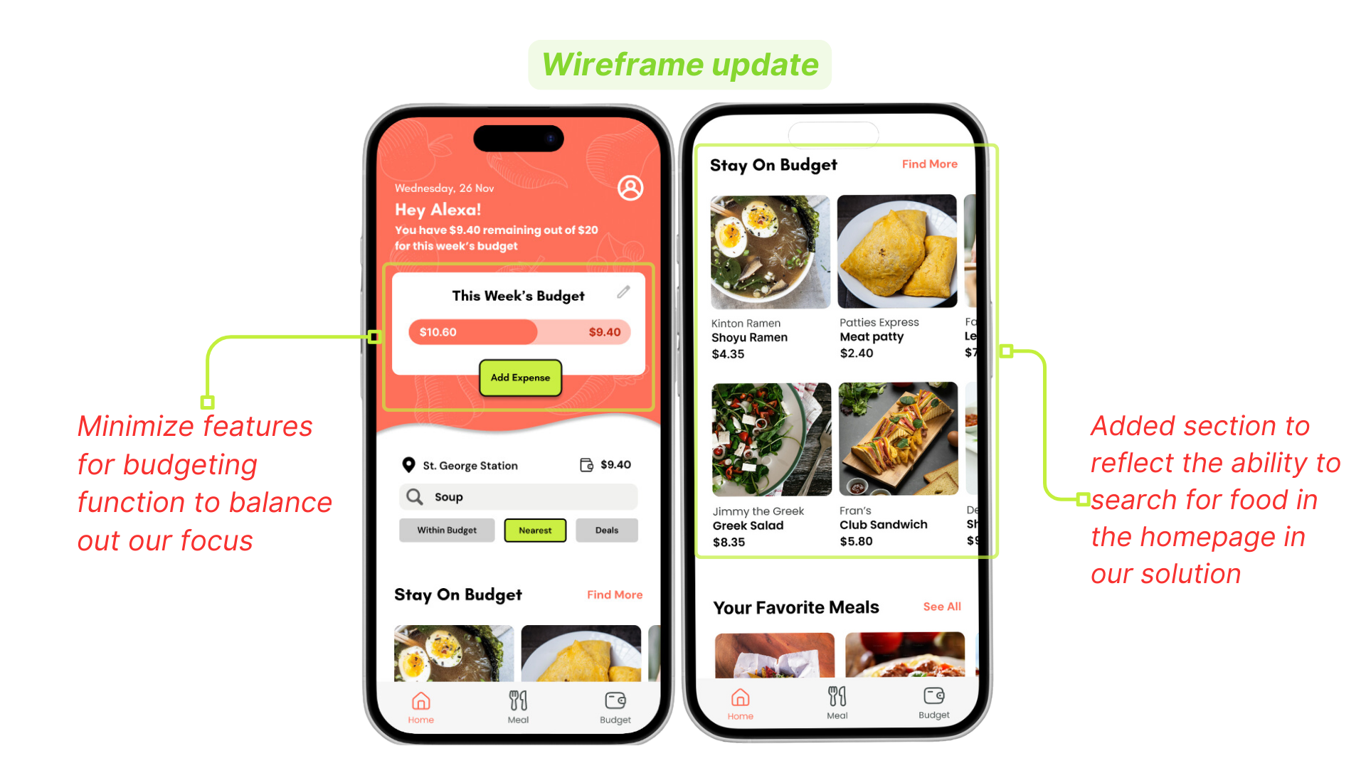
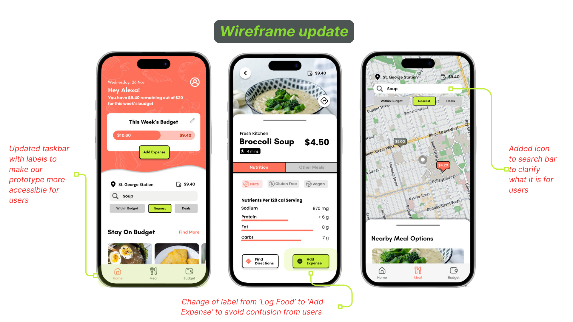
Enhancing User Experience and Accessibility
From our usability tests, some feedbacks were suggested to enhance the user experiences and make it more accessible
Labeling issues mentioned include:

Our updated wireframe addresses these issues to make our prototype experience more accessible and intuitive for users
4. Final Considerations and Details
By the last phase we had our final problem statement:
Help university students budget their meals and find convenient and nutrient balanced sources of food so that they can retain good health and accumulate savings.
We also revised our persona according to our user’s priorities.
Russel here goes to UofT:
He can’t find many meals as a pescatarian
Puts his health last
Loses track of his spending
Has a limited budget
How we solve his issues:
Provide various healthy meal options with nutritional information for a variety of diets near to him
Keep costs low and only offer meals in budget
Help students like Russel log and keep track of their expenses

Deciding On UI
This persona is slightly different layout and look from our group’s persona, I removed some things that I saw as unnecessary and added some details from our final pitch and feedback. 📸 Photo by Roman Matveev on Unsplash
Branding
The feelings we wanted to evoke when when users experience our app is one of refreshment, excitement and vibrancy
We used a palette of Grapefruit Red and Pear Green to emphasize the appetizing nature of the food that exists on the app
The red not only catches the eye of the user but also scientifically is associated with eating, increased appetite and food
The green denotes the app's use of financial accountability and budgeting features.

Group mood board, one for each member, mine is top left

Left to right: Individual style tiles we voted on, using the winner we made our own tiles for our mock-ups, the final style tile
We had many revisions of our tiles and tried exploring many avenues for layouts. We initially decided on a more cool toned teal palette but with guidance we were told that if we wanted to display vibrance, excitement and food a warm colour palette made more sense.

My style tile and UI mock-up

Finalized group mood board

My revised mock-up of a screen using the final tile
We all had similar yet different ideas on what should appear on the home screen since it is the first screen that the user sees. We looked at each other’s UI and cut and pasted the elements we wanted to include in the final version.

5. Next Steps and Takeaways
If I had more time…
Talk to more users + testing 💬
Pay attention to accessibility ♿
Flesh out a vendour side to the app 🏷️
Community aspect (ratings) ⭐
Create better documentation 📄
Explore linking with payment 💸
Lessons learned:
Every part of the process is crucial!
We are not designing in a bubble 🫧
When in doubt: stick to the data 📊
Mentorship is a must!