

Overview
Timeline: 3 weeks~ in 2023, updates from 2024/5
This project was done as a design exercise to get familiar with thinking through user issues, potential solutions and how to create wireframes in software.
-
Here, I get an idea of what users of Amazon Prime Video have issue with and what those issues are more specifically. Those being, the display, segmentation of content and findability of content.
-
Here, I look at features of other applications and tools that would be ideal to integrate into the solution for APV.
-
Here, I look at what the improvements or changes to the design of APV should accomplish for the user.
Problem
Amazon Prime Video (APV) users do not find the controls and display to be intuitive both on TVs, computer monitors and mobile devices as they take up too much space, not allowing them to view content as they prefer. Additionally, there is a heavy presence of advertising where there was not previously which cannot be hidden by the user paying for the service. Such issues push users away from using the streaming service even if they have the streaming service as a biproduct of their Amazon Prime account used at the storefront.
Solution
I designed a visual display preference menu to allow the user to change the size and visual preferences on their account from their home screen. The menu ranges from allowing users to control the visual layout of their home screen, to disabling ads throughout their available library of media. These changes will allow for APV to be more detached from the layout of the Amazon storefront and make it feel like its own service.
Defining User Needs
I am often recommended to use APV by friends and family as it does have some good content. But at the same time, their recommendations are coupled with a disdain for the way the interface and the service functions.
While Amazon Prime Video’s UI is not terrible at first glance, there are some key features that are missed which are noted by many users on forums after the most recent update in spring of 2023.


Users note that the size of the movie and TV show posters and text are too large especially when viewing them on a larger monitor where they take up much of the screen while not displaying as much as it potentially could.
While such a size of poster may be good for those who may be visually impaired (as most accessibility settings are targeted to those who are hearing impaired), the majority of users would want to view as much content as possible in as little time as possible. This means not having to swipe or scroll through multiple pages.
Previous versions of APV on browser allowed for the user to control the size of the poster tiles by zooming out, however that feature was taken away long before the new 2023 update.
Video: http://surl.li/jrila
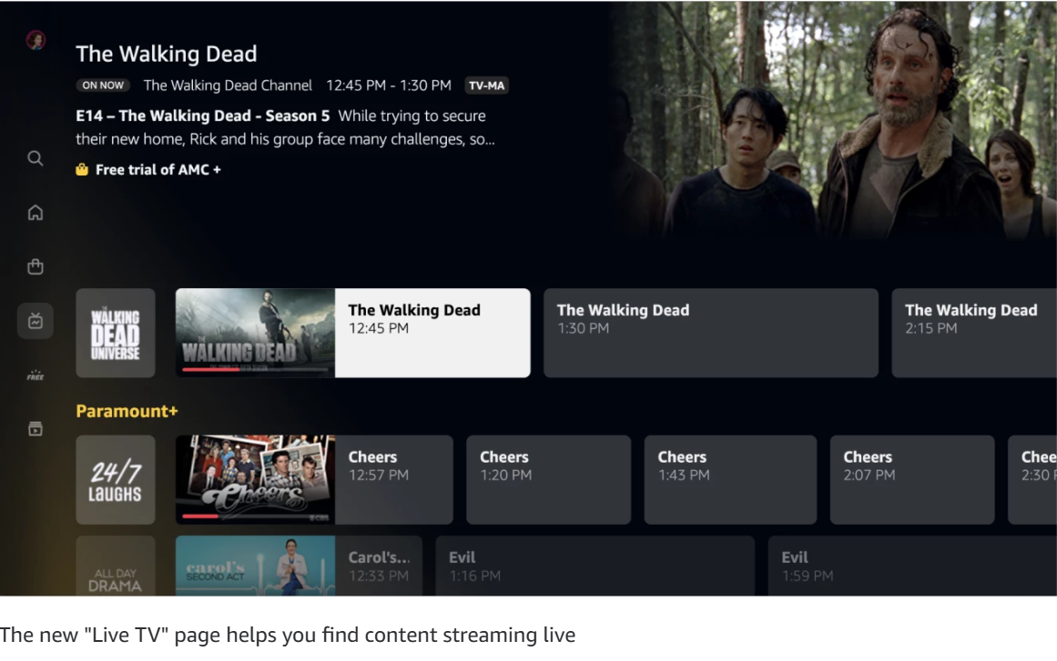
As of 2023 the user were to examine the top of the screen in browser, the side bar in the APV computer application or the bottom tabs of the mobile app they will find that there is not a place to change visual preferences. 2024 has brought some small changes to both mobile and web/desktop application.

from 2023

from 2024/5

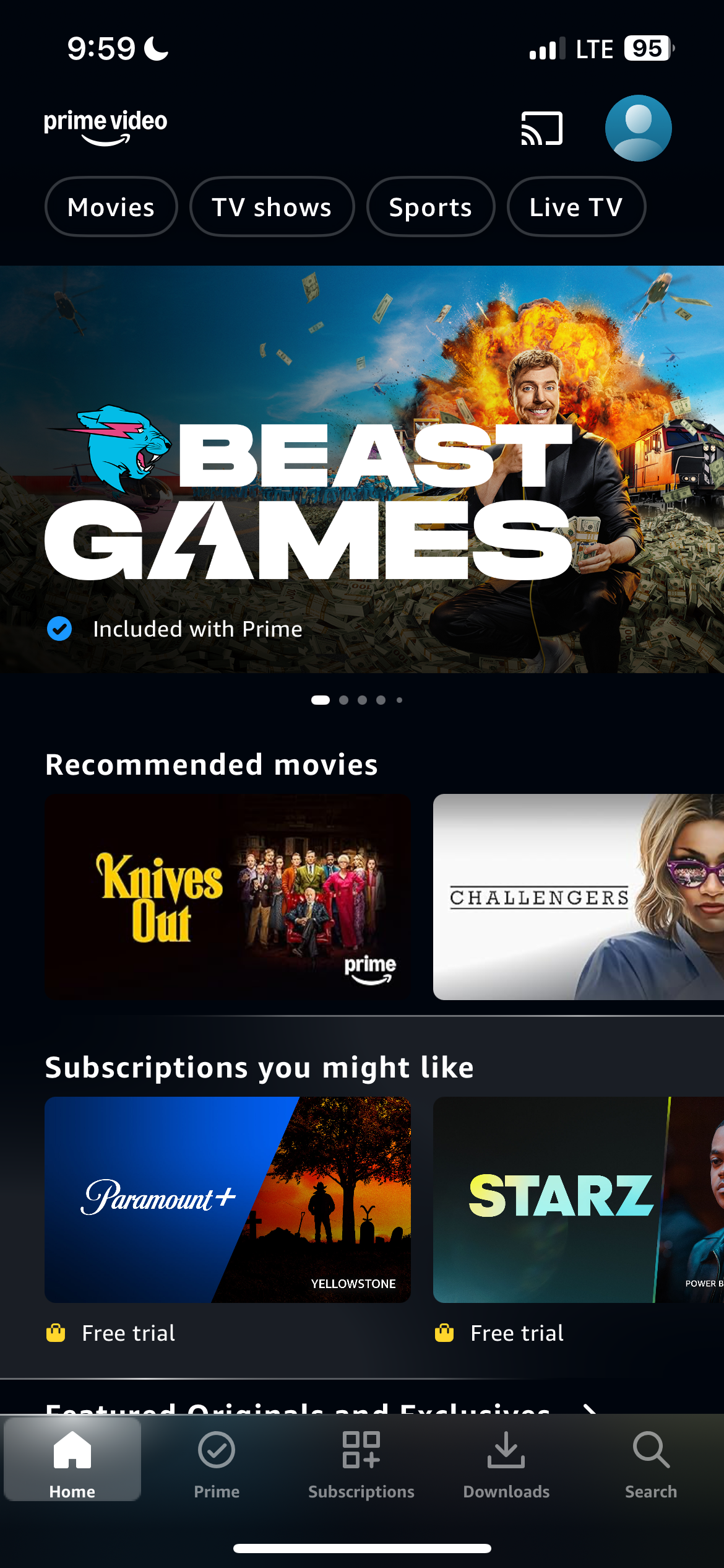
from 2023
from 2024/5
Even if the user does go into their settings the only options they have for the layout of their screen is the following:
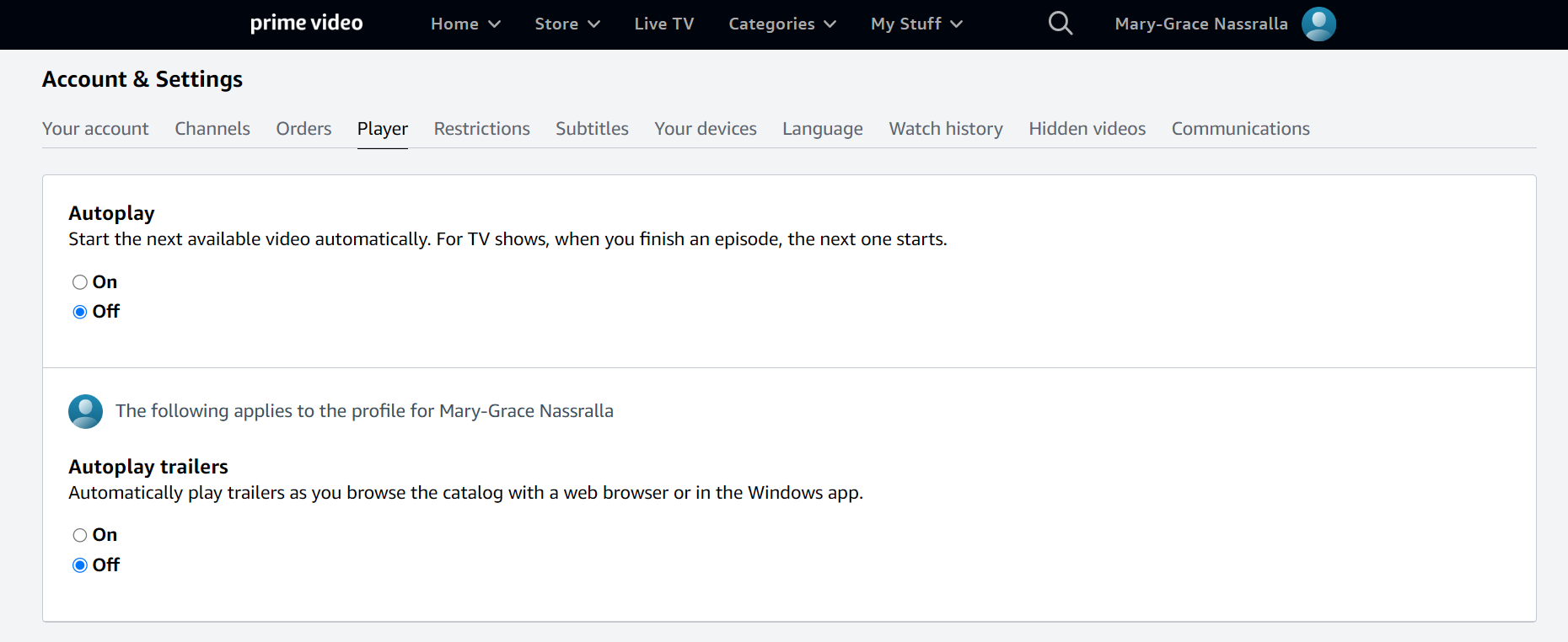

from 2023
from 2023
It’s clear that the user has little control of how they want to display their home page. What’s worse is that the unfavourable UI of the home screen and the rest of the website are compounded on by other issues. The first one namely being the increasing presence of ads and content for additional fees.
On a paid streaming service, it is unusual to have ads be present. But Amazon is able to do this because they are advertising other streaming services.
On the mobile APV app there is already the ability to filter media that is not included with prime such as media advertising the services of STARZ, Stack TV and Discovery+, however on the browser it does not appear to give such an option.

If the service is being paid for either through an Amazon Prime account or externally for $14.99 CAD a month, then it would be suitable to create a way to turn off the view of media behind a paywall or add other levels of subscription that would be totally ad-free just as Netflix and other services have done.
Nevertheless, such subscription plans do not exist at the moment (as of early 2023) as the membership is sometimes merely a way to buy permission to buy other media rather than watch them for free.


Some additional issues that can be solved through the visual preferences menu would be:
The difficulty users have in attaining adequate search results for media. There have been complaints of the search function to be quite limited in results.
Some users find that even when searching and filtering by genre, the results can still remain limited, thus an expansion of categories is needed or more in depth metadata should be put into each TV show or movie.
A quick fix for the search issue would be expanding what the user is able to see in the search result with the existing data like their titles. An alphabetical scrolling or viewing feature might do the trick.
Delving deeper into the issue of media discoverability, the layout of the service actually hinders users from accessing free content as well.
APV is said to have a large library of free media to watch, but its interface can only search and then filter for free media rather than have a separate category for it without having to search. Moreover, it is difficult to see what free content has newly been released, on the home page.
The issue of viewing free media more easily and refining searches can be remedied through the preference menu coupled with some extra back-end work updating the metadata of media to be able to be found more easily during complex searches.

Feature Research
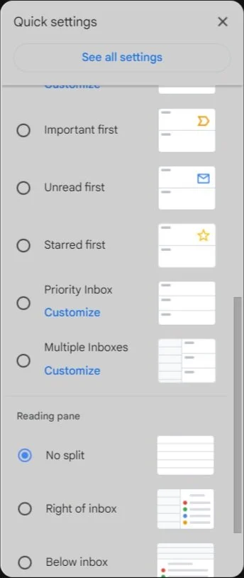
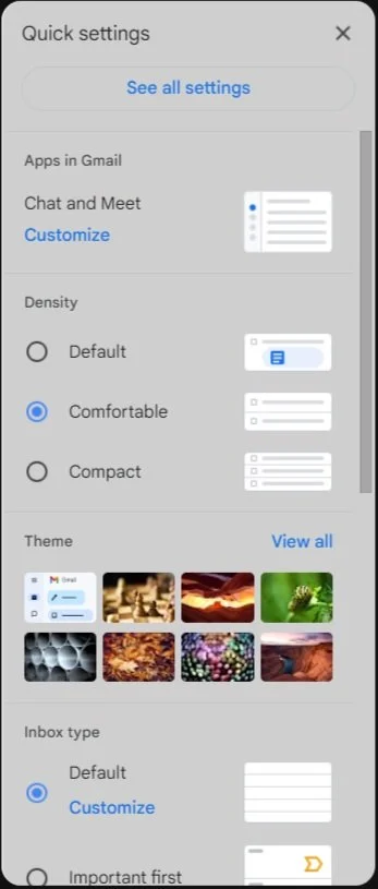
It should be feasible to design a similar menu to Gmail’s ‘Quick settings’ that is accessible on the home screen, or on the banner of the website and app that allows for the user to quickly make changes to the layout of the media. Moreover, users should be able to alter what they want to see on their home screen.
Here is what the menu might look like for the home screen:

Design Goals
My idea for the preference menu was mainly influenced by the visual controls in Gmail.
Gmail gives the user the ability to adjust the viewing density of messages, the background and theme, viewing priorities in the inbox and how the space is broken up with emails and other categories of mail that arrive.
These settings are able to be opened directly next to your primary inbox without going to another page as ‘Quick settings’.
The user is able to alter the format of their home screen to their liking in areas like size and brightness. They are also able to access settings that would otherwise have to be accessed through account settings farther away from the home screen like auto-play trailers.
It is important to redesign the UI and overall UX of APV ultimately because it has potential for the user who enjoys the service, and that potential is not being tapped into.
In order to understand what the user is losing, we must identify who uses the services and for what purpose. The forum posts I went through showed what are some of the pain points people had.
However, because I did not have access to the data of a significant user base, this persona is more or less explorative and speculative*.

Photo by Daniel Xavier
Next Steps and Takeaways
The small wireframe prototype of the preference menu above is still somewhat low fidelity. My next task will be adding a more complete wireframe of the preference menu with additional features, especially on different devices. The wireframe I made is relatively mid-fidelity and it would be beneficial to take make one that is more appropriate for different devices.
Redesigning an already existing service is not something I have done before. Additionally, in my previous education I was never really pushed towards imagining or creating solutions for issues. I was quite intrigued at the possibility to redesign something many people use and would like to appreciate more if given the chance of using it to its fullest ability.
This project was an edifying exercise in gathering information based on users and transforming them into quite tangible results that would benefit many users of APV who are desiring change in the current interface. I thoroughly enjoyed exploring the ‘what if?’ of each issue. I also think that the final product or menu created might be of benefit to other streaming services or media services in general that have a limited visual display for the user.
Updates
Amazon released this update about its “newly redesigned Prime Video experience” which is supposed to tackles some of the issues above. There are some noticeable improvements while other things stay the same.
Let’s take them one by one.
Claim 1: A more user-friendly navigation menu
APV claims to allow users to browse more efficiently through its different sections through different pages.
But, the home page still displays sections the user might not want to see including paid content, ads or things that are not in accordance with their interests.
The home page should be a place to primarily continue watching something that has already started, which APV has improved on having it be a top row on the Home page.
Additionally, its secondary purpose should be browsing things of the user’s interest rather than showing things to be rented.
I acknowledge that many users may appreciate subscriptions or content to rent on their home page but those who do not should be given the choice not to see it.
Claim 2: skipping because it deals with a sectioned off page for Live Sports
Claim 3: A faster way to find the shows you want
Amazon’s idea of “what the user wants” does not seem to be founded in research.
They say the updates “enable customers to quickly and efficiently find something to stream…” using top-ten lists, carousels and larger posters or images.
While this is not unhelpful, users might not see lists or carousels as a sufficient way to browse for them personally. Some users may not care about what is popular, but want personalized recommendations or be able to find free content easily through the search function. The update does not improve findability on the front of search but seeks to make users browse.
Claim 4: Clearly marked content
Claim 5: Immersive visuals
It may be true that APV has become less overwhelming for users but, there still does not seem to be a way for users to reduce the size of content to their liking on Television or smart phone. As of 2024/5 users can once again reduce the size of titles by zooming out when in browser.
But this makes it so that they have to continue to zoom in and out.
Claim 6: Find your favorites—or something entirely new
Here is where findability and search improve significantly.
It seems that the metadata is much more detailed as the search is able to now yield accurate results to the user’s input.
Previously, users would get results unrelated to their search.